
SCOPE
Brand Identity, Worldbuilding, 3D & Motion, Environmental Design
INDUSTRY
Speculative Fiction / Environmental Design
STAGE
Self-Initiated
WAKE FROM DEATH, AND RETURN TO LIFE.
Cell Operations is a brand about connection. The icon is cells finding each other, separate units that only mean something once they link up. I created Cell Operations end to end: brand identity, world-building and lore.
It started as a self-initiated test: give a brand hard constraints and see what it's forced to become. No budget, no ad space, no attention. If it can't buy reach or lean on virality, what does it have to look like... and how does it find people?
So there's no pitch, no convincing, you don't get bombarded by Cell Operations, you find it, and the finding means something an impression never could.
Wake from death, and return to life: reminders of meaning surround us. Strip away the noise and focus on the experiences that connect us.
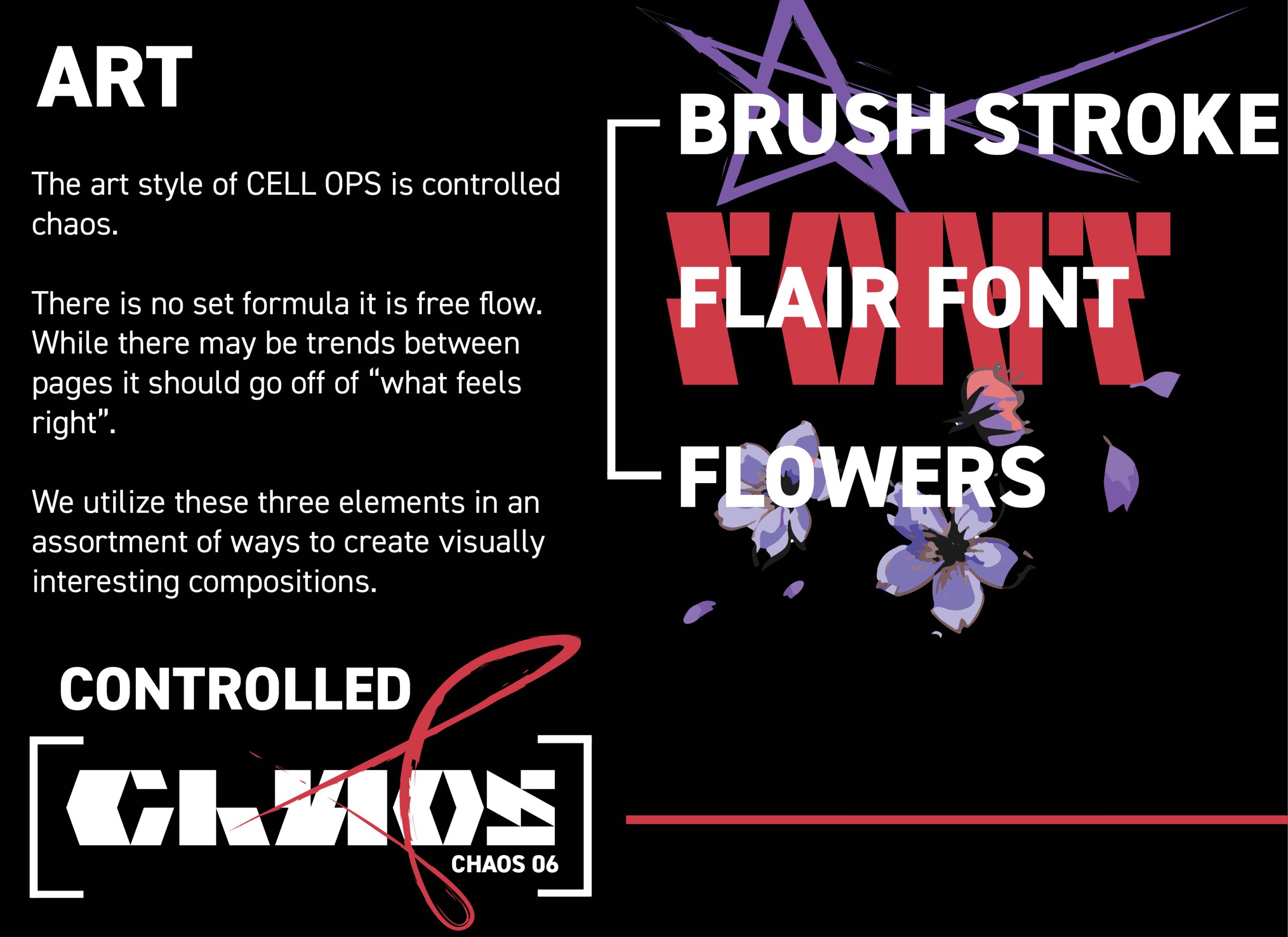
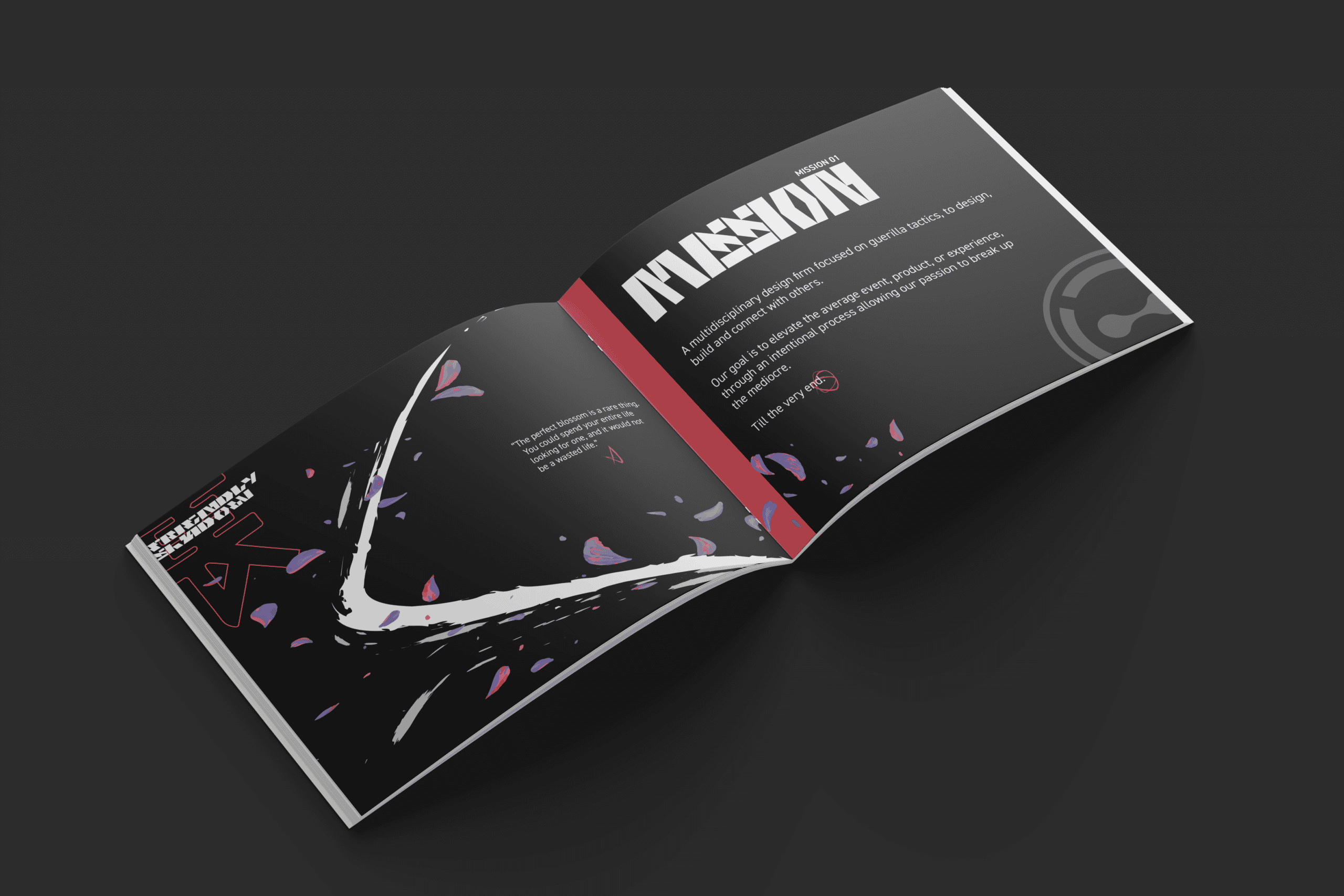
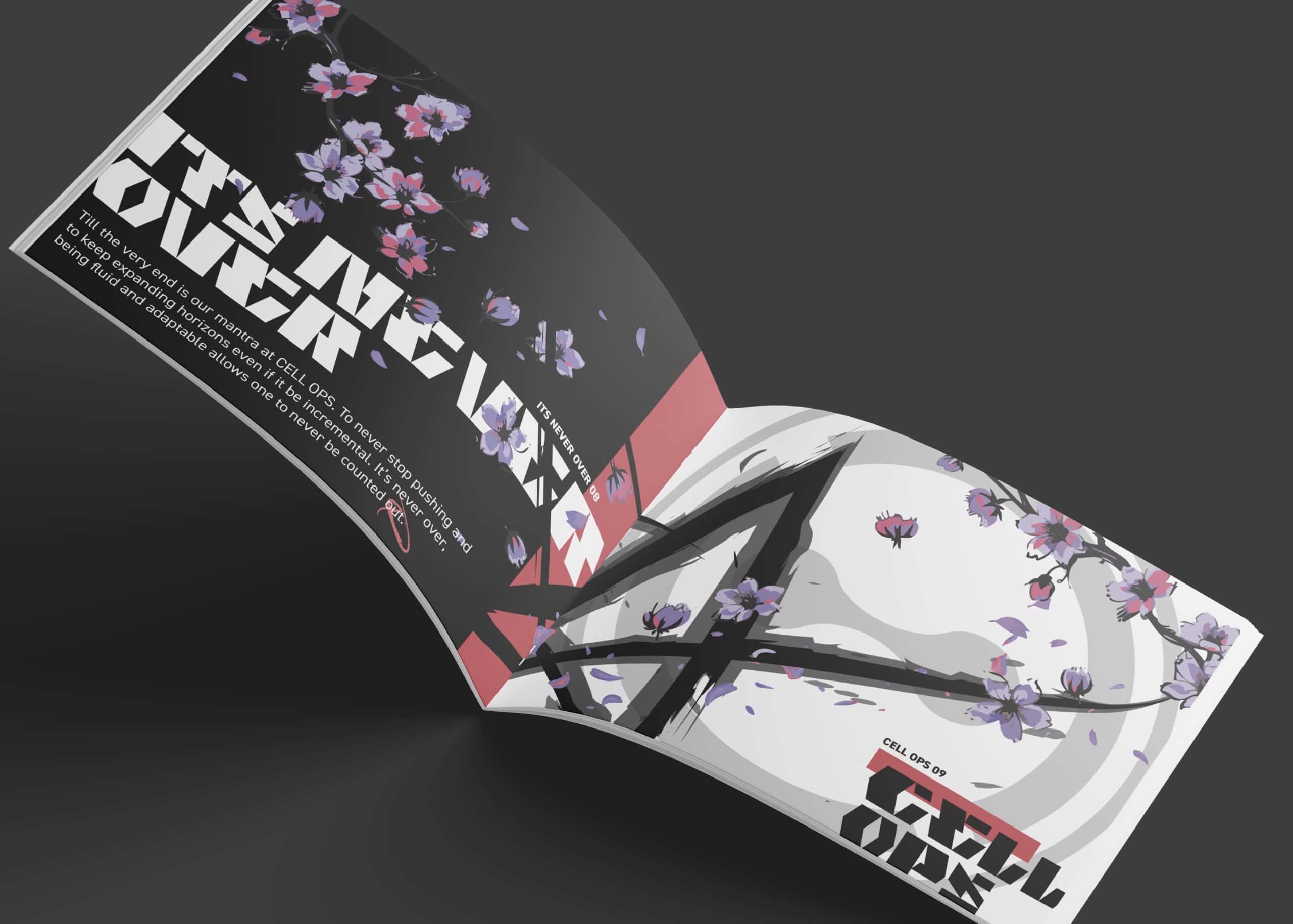
The palette is almost all black because it strips away everything fighting for attention so the eye lands only on what's revealed. Heavy white space, cherry blossoms, and the manipulation of the black inky anomaly converted into brush strokes. The small human details hit harder when we isolate them.
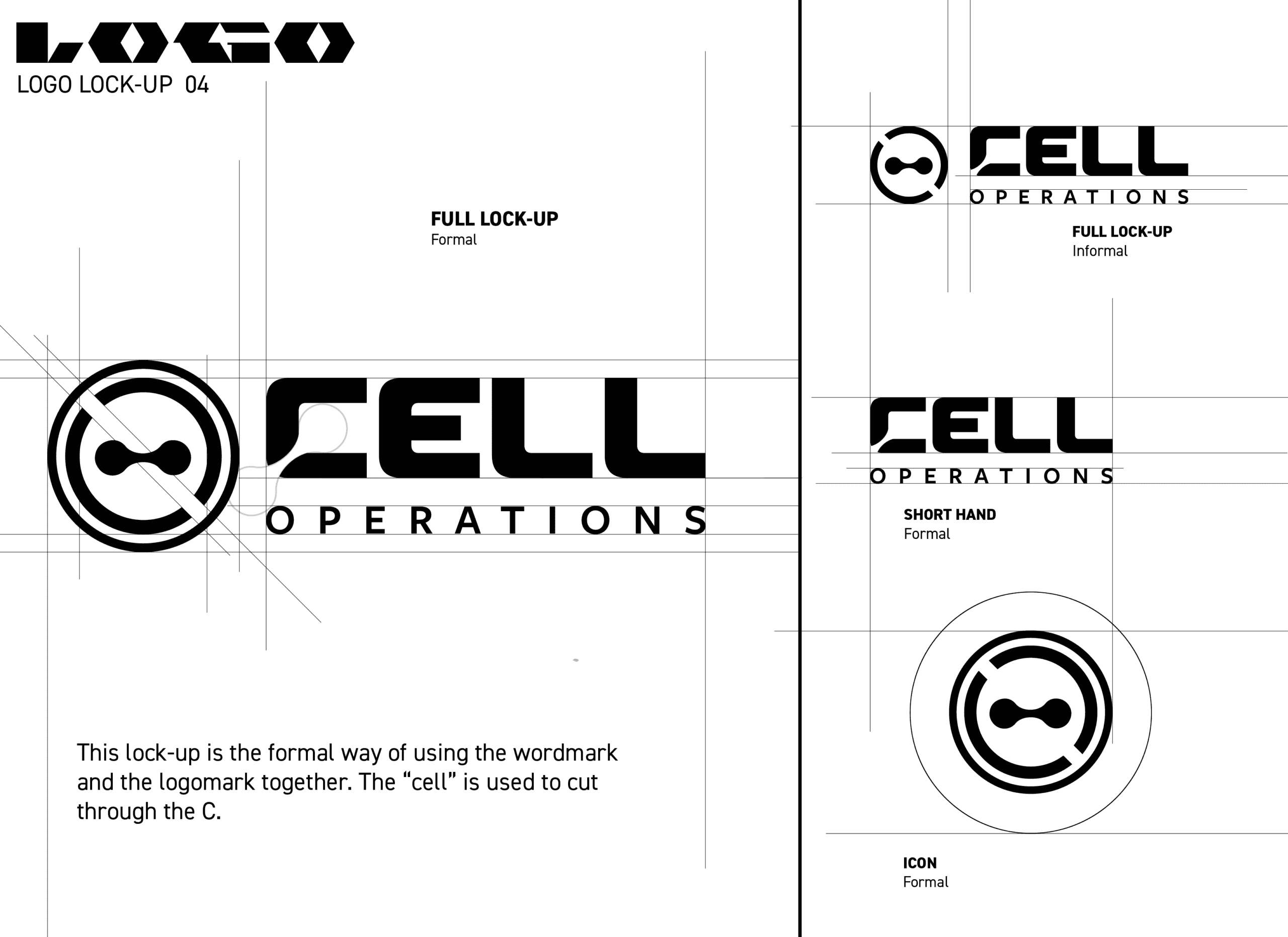
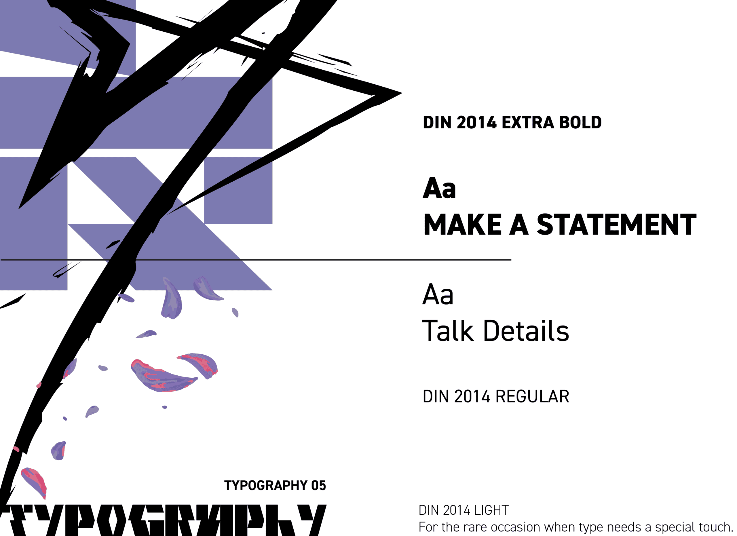
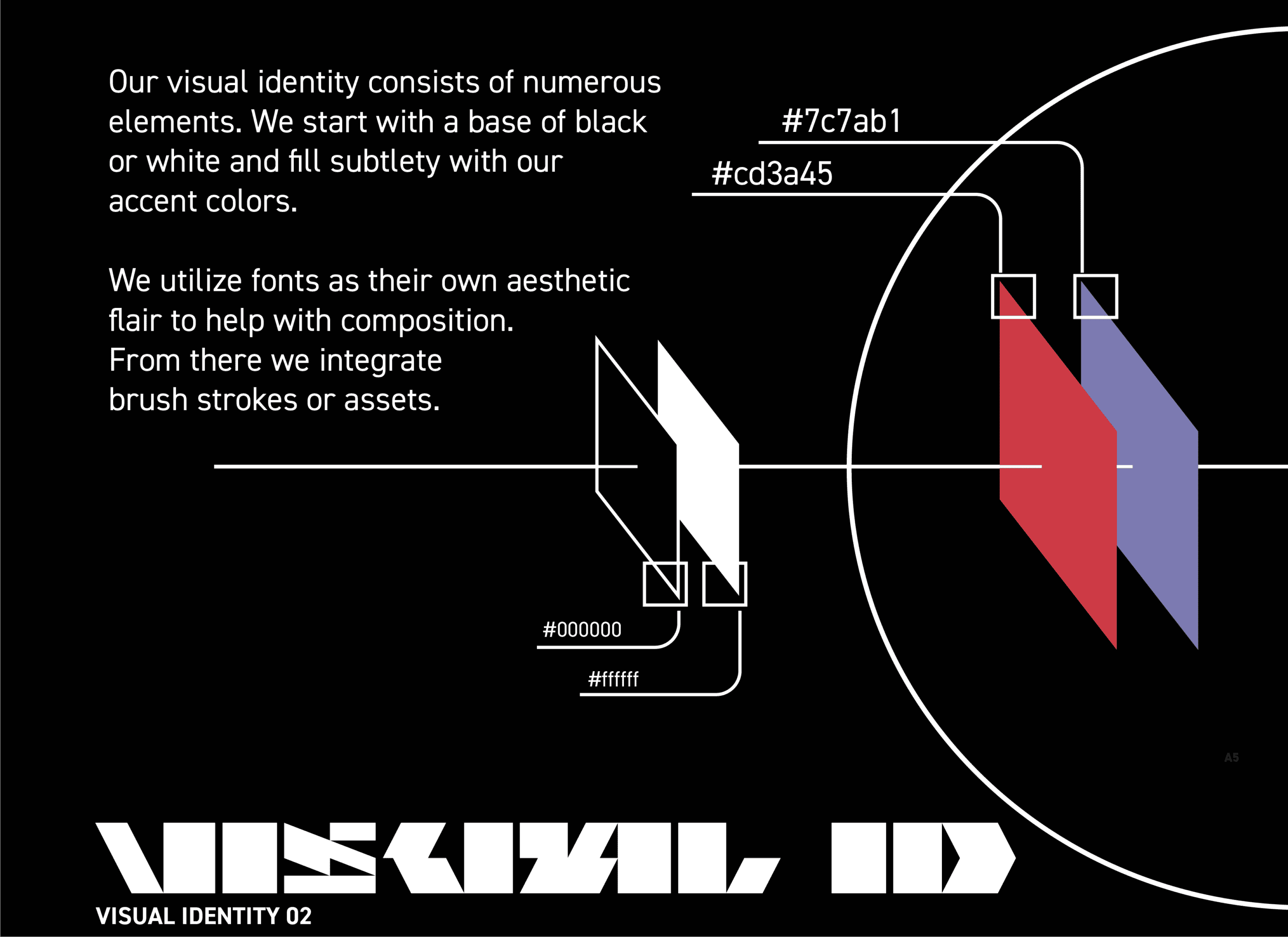
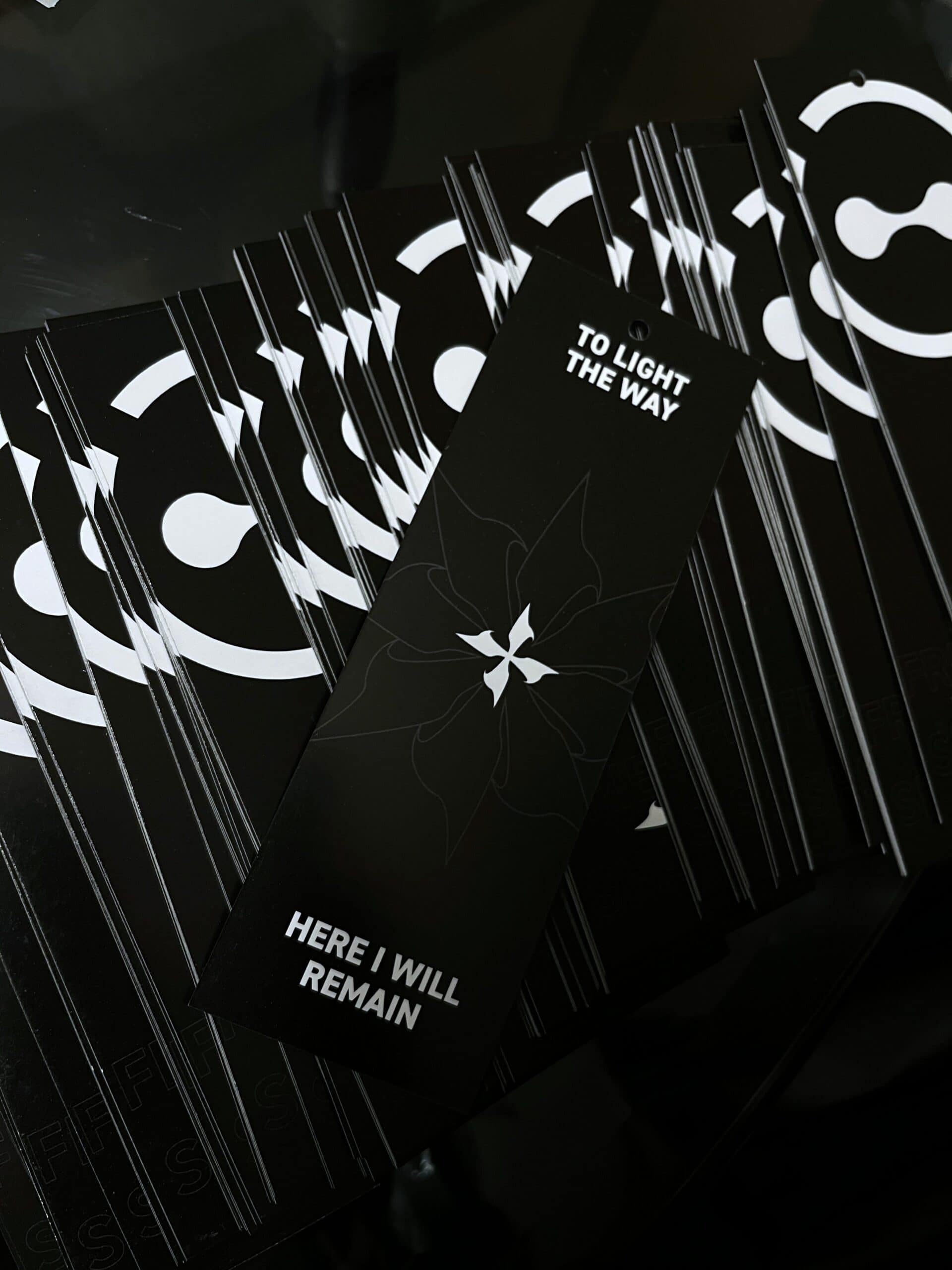
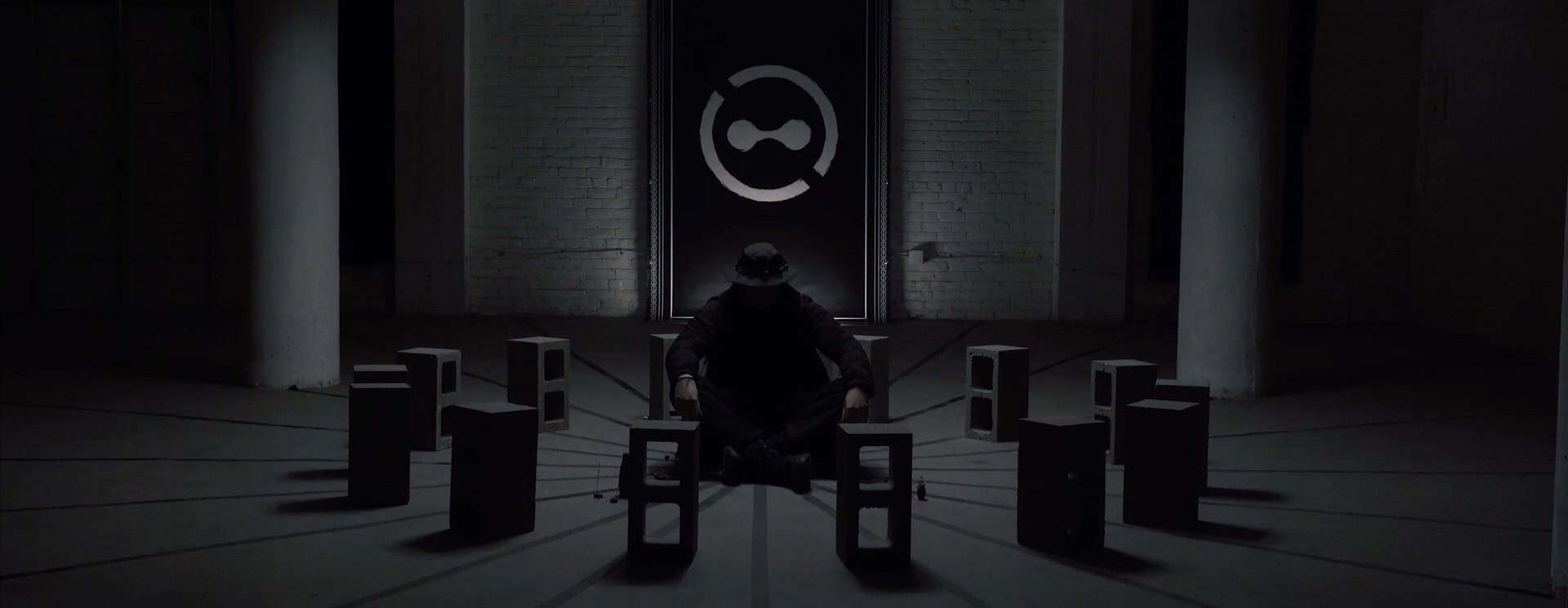
Pictured Cell Ops banner 12ft. Still from a short film exploring how the human spirit survives in a desolate world.
Contact Points
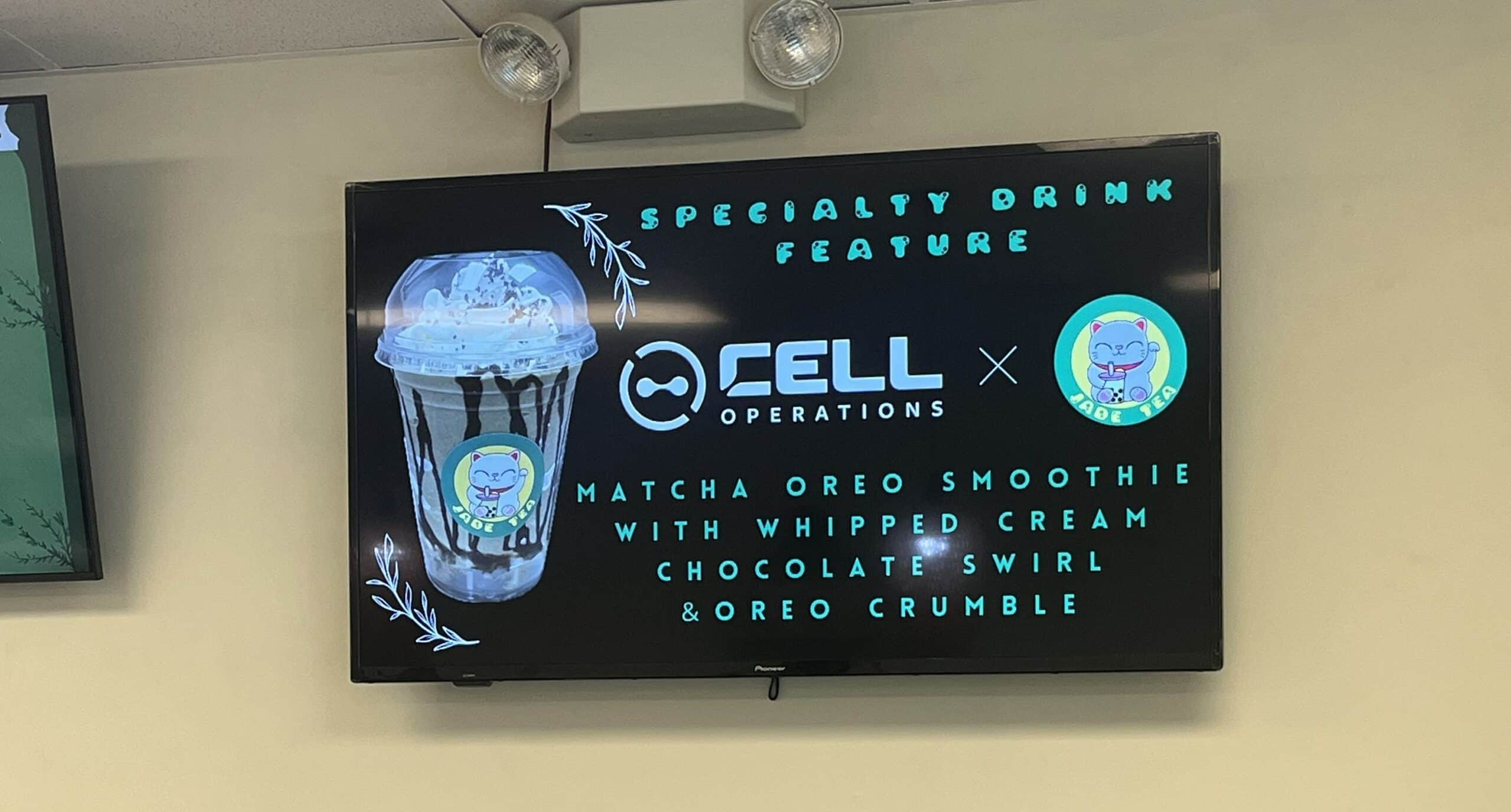
Every brand, even those in dystopia, needs touchpoints. For Cell Operations, traditional channels aren't an option. So the contact points had to be built into the environment. Stickers on brick walls, hijacked gas station screens, messages embedded in infrastructure. Things designed to break the norm, not routine.
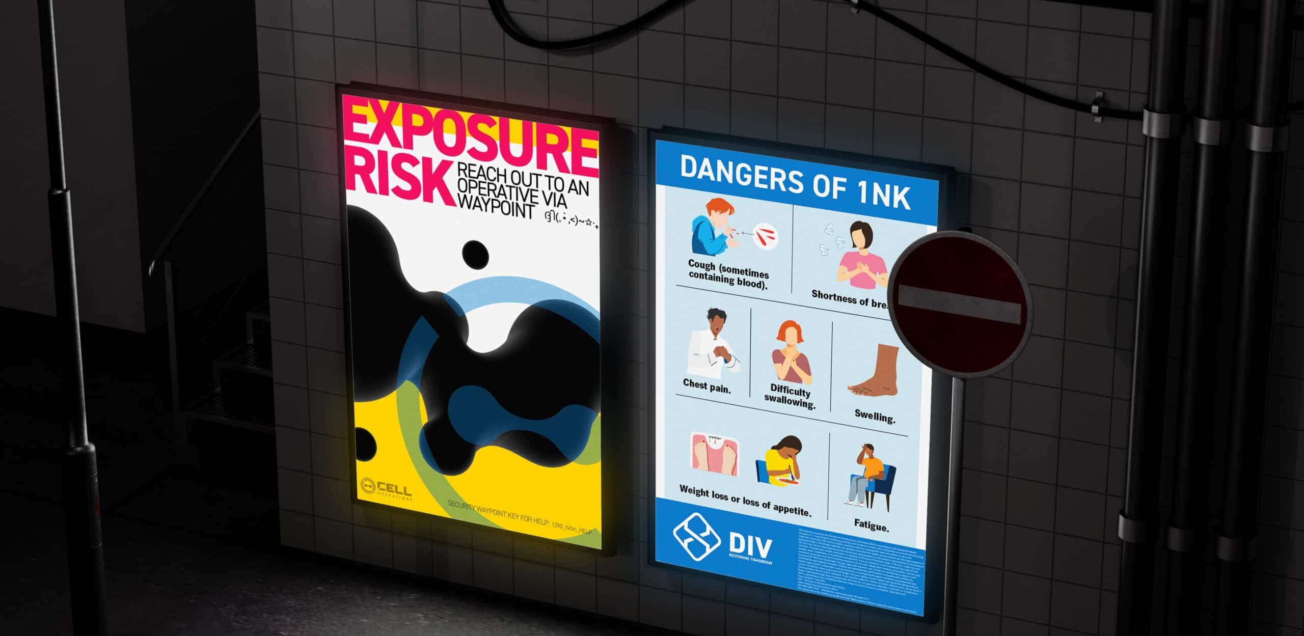
Environmental Exploration
Exploration of different mediums to flesh out the worldingbuilding and branding. 3D renders and video was utilized to blur the lines of reality and fiction.
Outcome
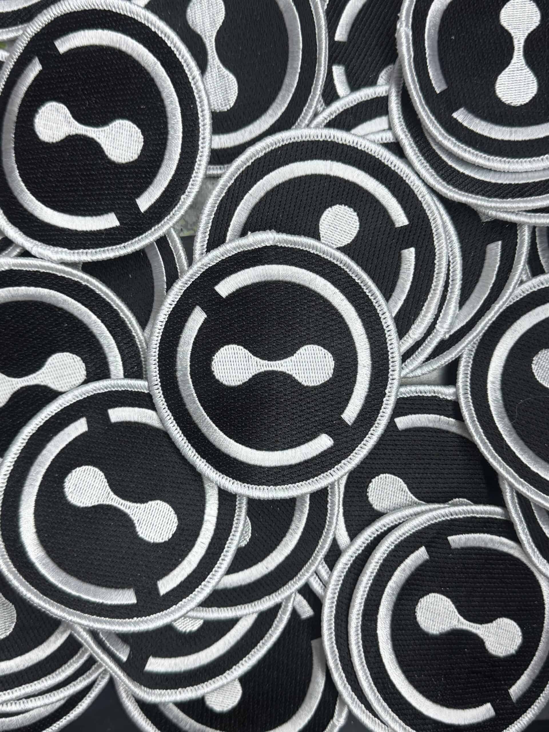
Cell Operations started as a concept and became something people actually engaged with. The logo has been worn on patches and hats, stuck on walls in multiple cities, and featured in a collaboration with a local coffee shop. People bought into the world without needing it explained to them, it made people want to be part of something.
As a design exercise, this project pushed me through every discipline I work in. Brand identity, typography, illustration, 3D visualization, motion, physical fabrication, narrative writing, print production. Not as separate skills but as parts of one system that had to hold together across all of them.